TikTok: Reimagining the web experience
TikTok Web had become a fragmented experience, with features built independently over time and little consistency across the product. As web emerged as a strategic growth opportunity in 2024, our team led a complete redesign—creating a scalable component library, improving usability, and establishing a cohesive experience that better reflected the TikTok brand. I served as the design lead and primary cross-functional point of contact for this initiative.
Users
Research showed that TikTok Web was often used for quick, passive viewing rather than deep engagement. Users consistently valued the larger-screen experience but struggled with discoverability, navigation, and feature parity compared to the mobile app.
User Interview Insights
Users felt less immersed in the content than they do on mobile.
Users experienced issues that prevent them from having an immersive experience like they do on the native app.
Users struggled to find content they liked.
The web experience didn’t effectively surface personalized or engaging content, making it harder for users to discover videos they enjoyed.
Users found it difficult to navigate and engage with content.
The lack of a clear visual hierarchy made it hard for users to know where to focus their attention, leading to reduced interaction with key features.
Design Audit Insights
Inconsistent visual and interaction patterns
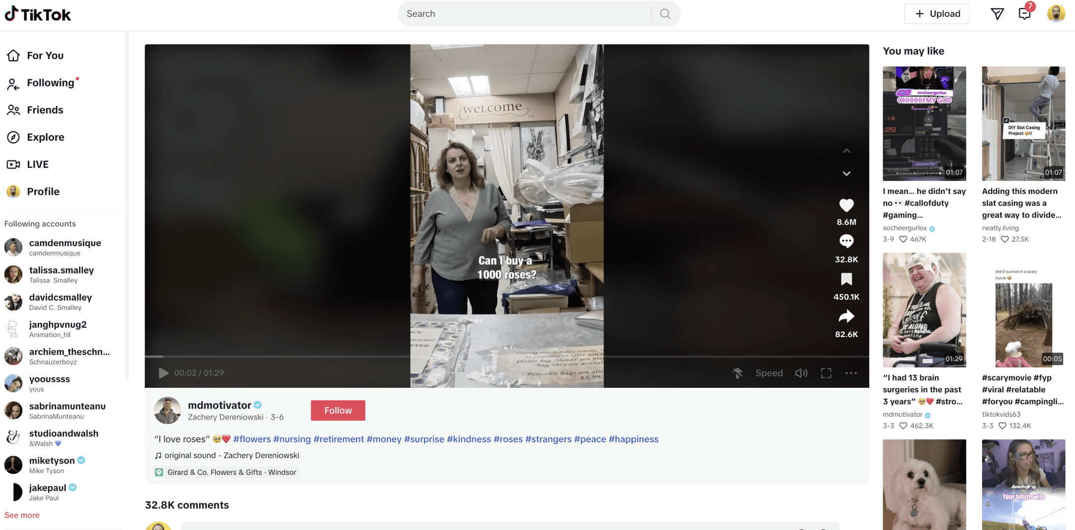
The web experience was built with mobile components, which resulted in unexpected visual and interaction patterns.




Visual clutter, not prioritizing content
The original design lacked a clear structure for prioritizing content, making it difficult for users to engage with what mattered most. This misalignment failed to reflect TikTok’s core value proposition of showcasing engaging, entertaining content front and center.
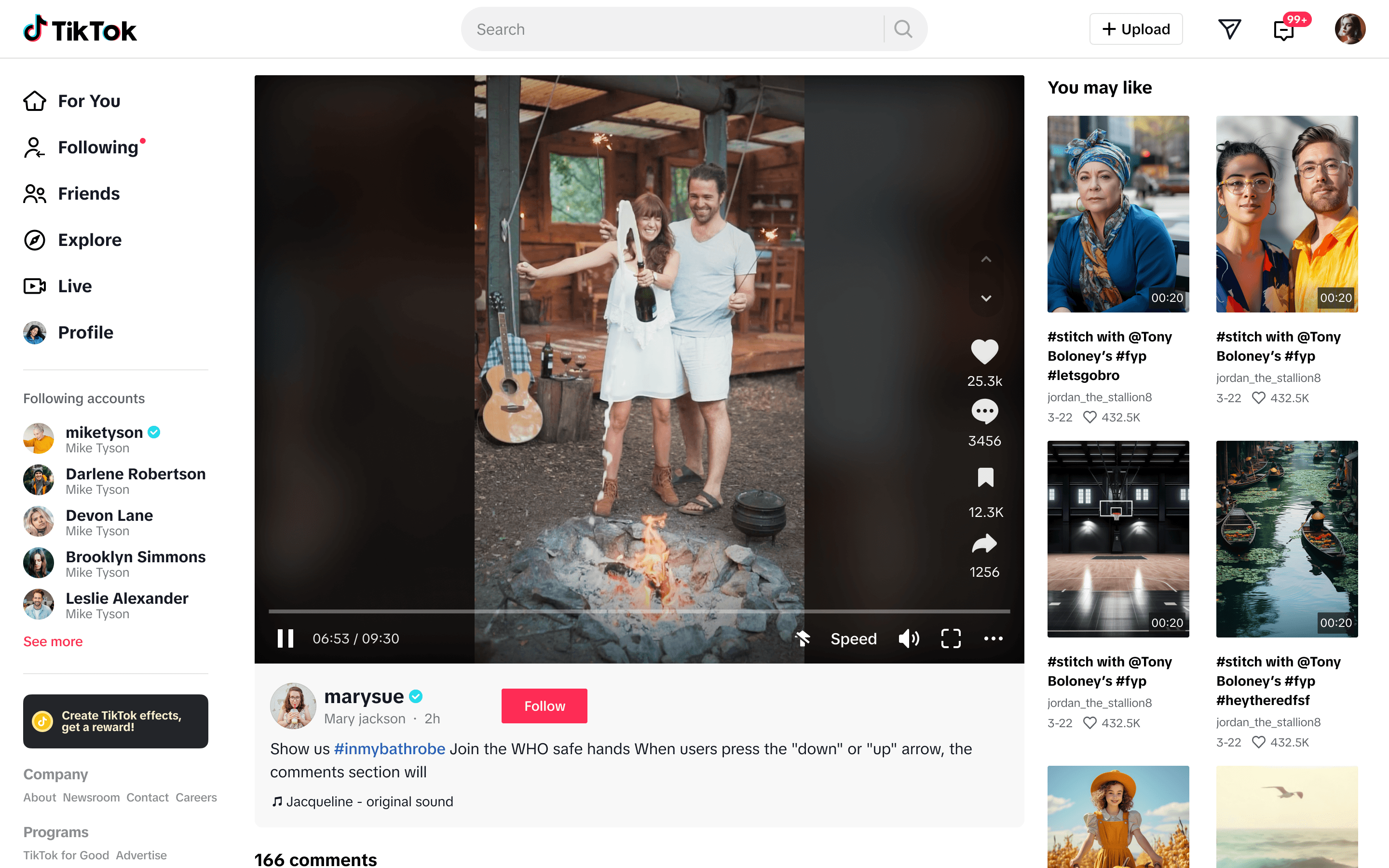
Lack of a standardized video experience
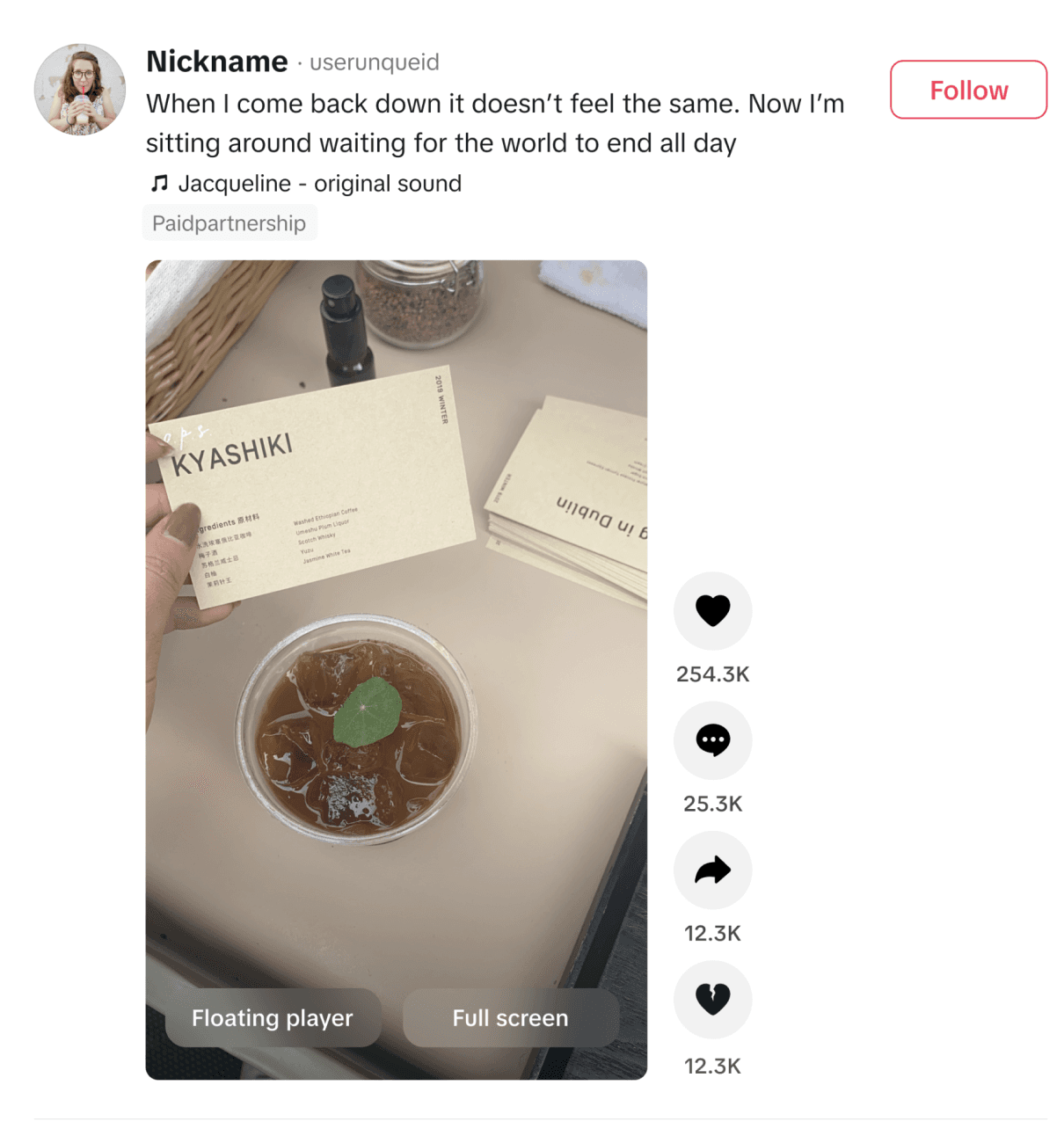
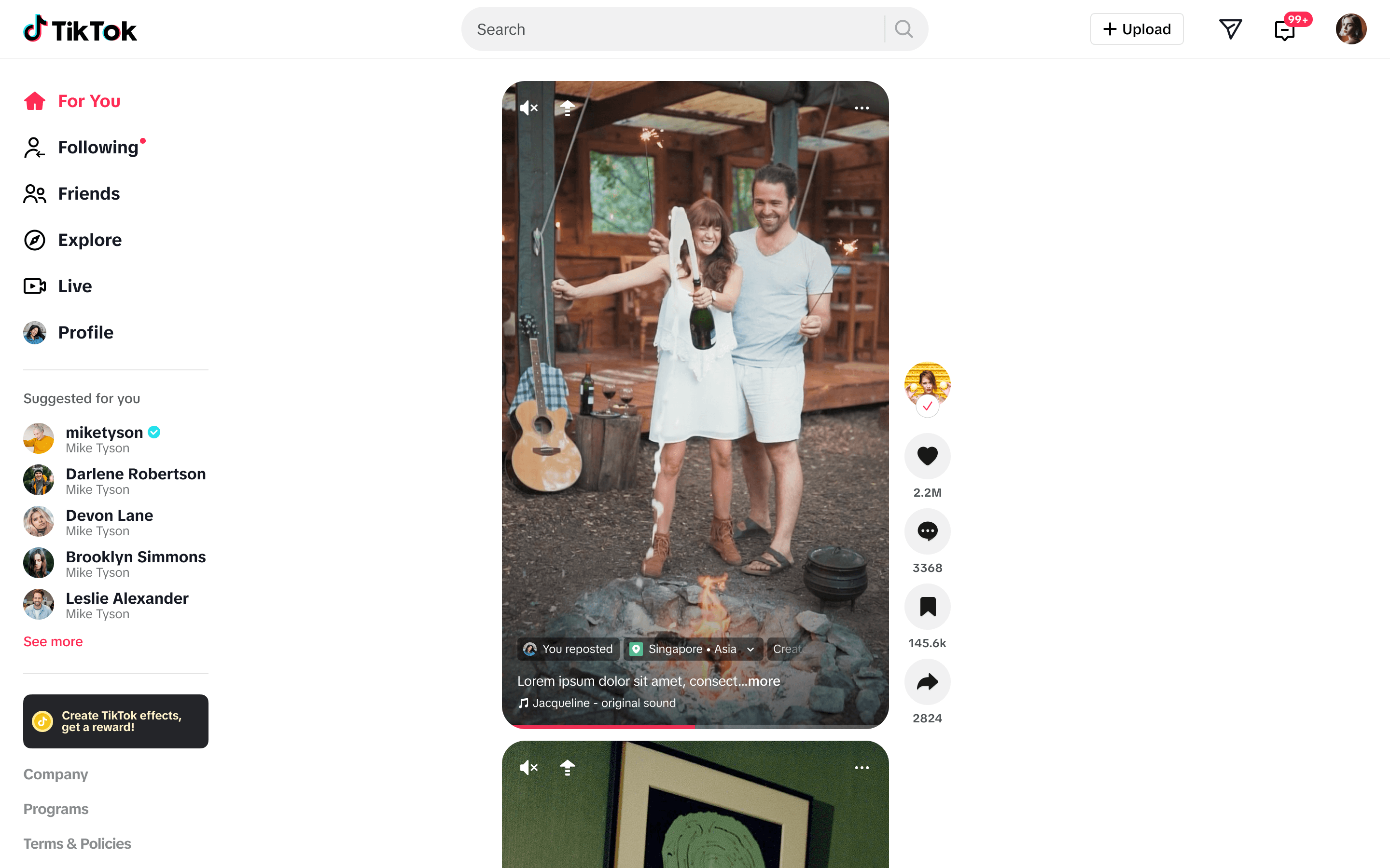
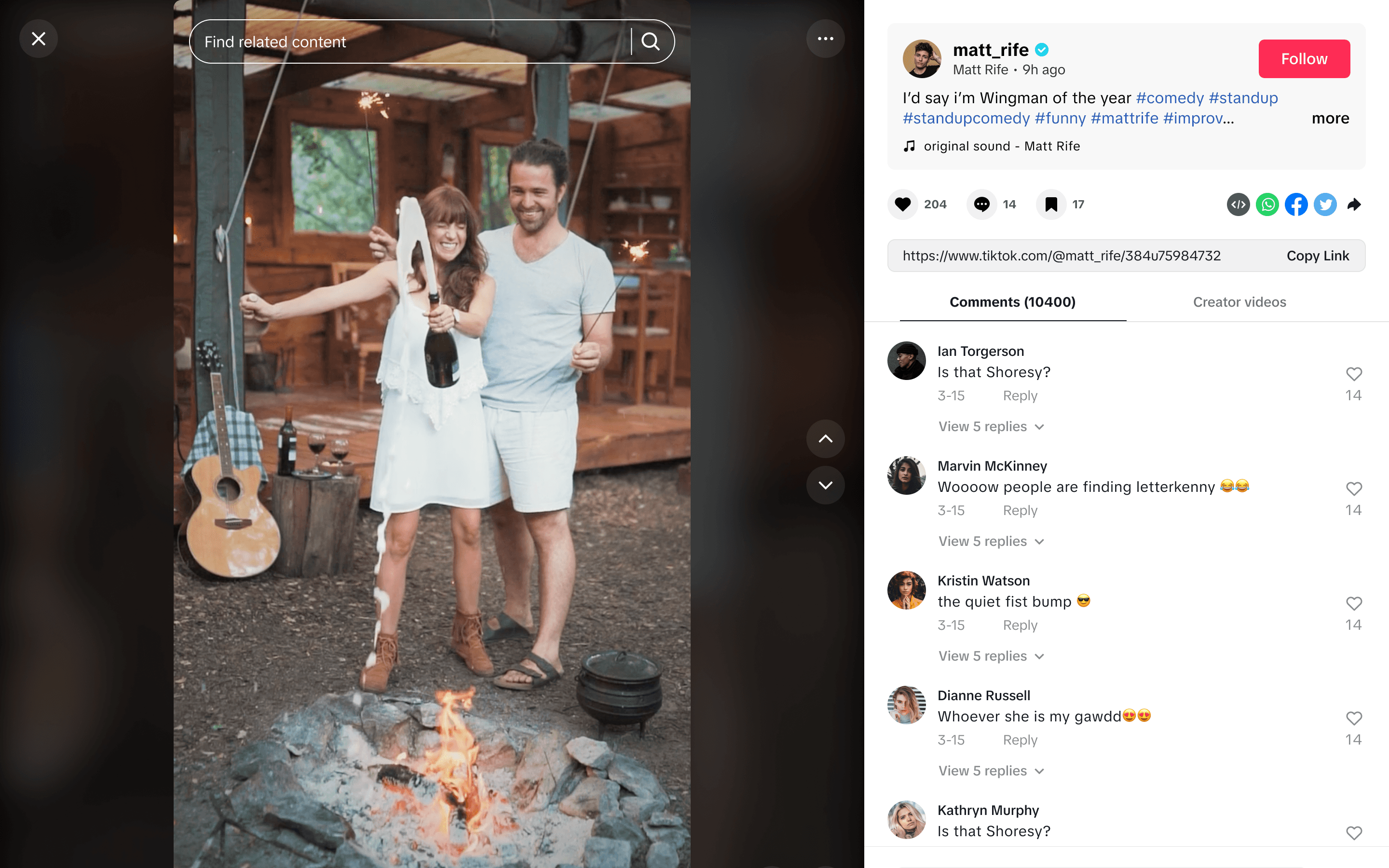
There were three different video players across key pages (For You, Browser mode, SEO page), each with its own layout, creating confusion for users who encountered inconsistent interactions and designs.
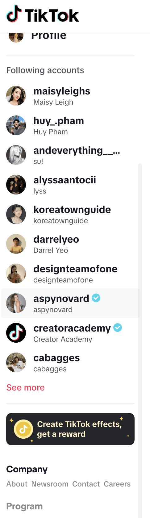
Inefficient navigation
Overlapping horizontal and vertical navigation created a cluttered hierarchy, making key destinations harder to find and distracting from the core content experience.
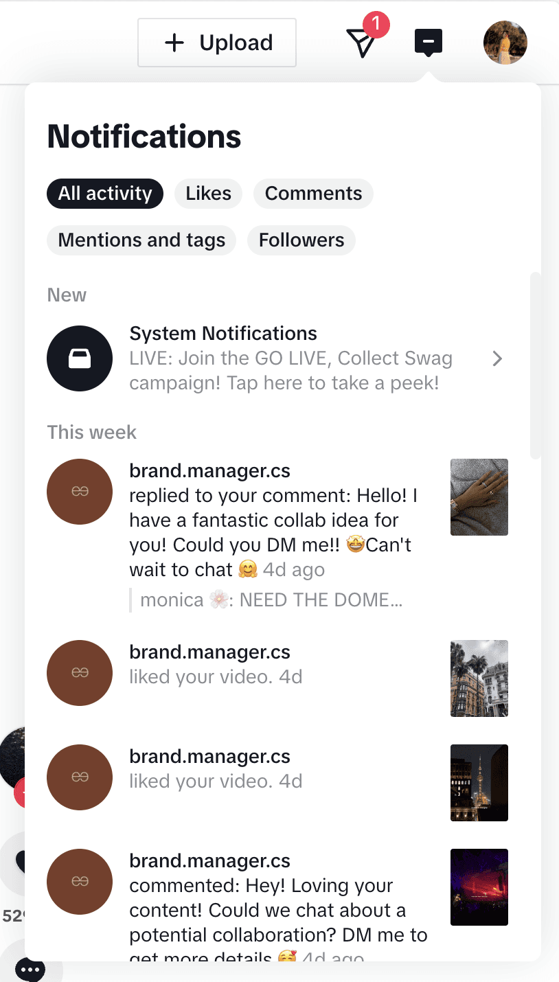
Poor responsiveness
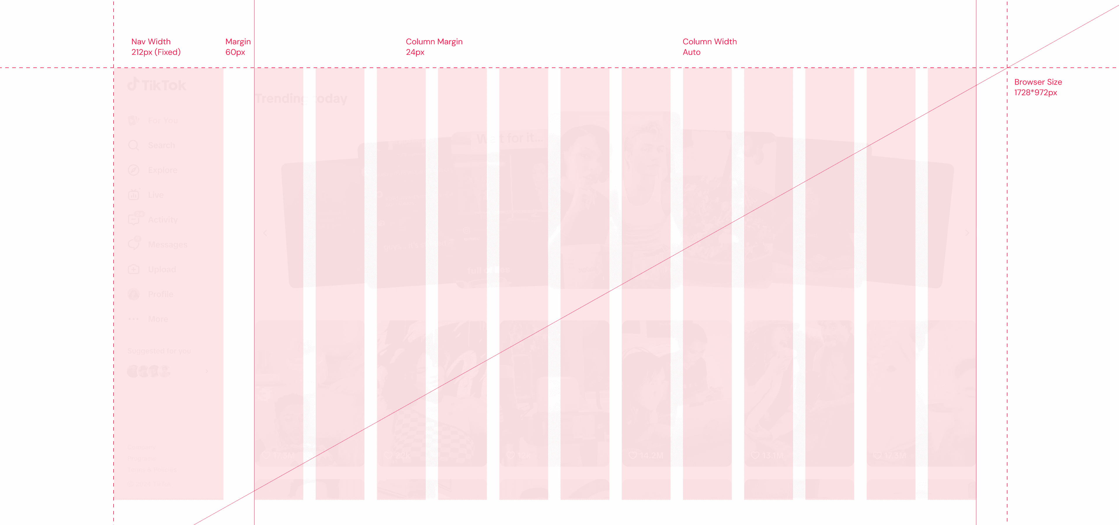
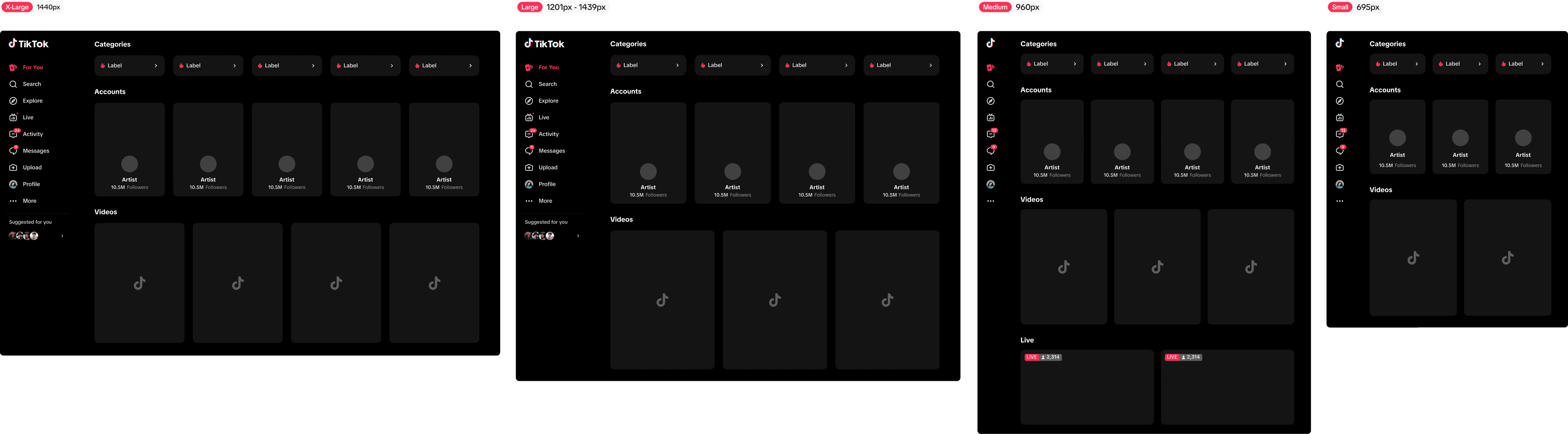
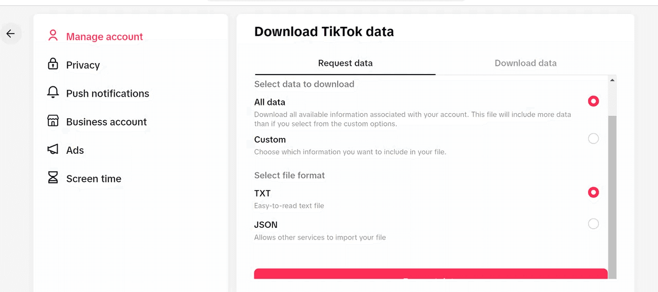
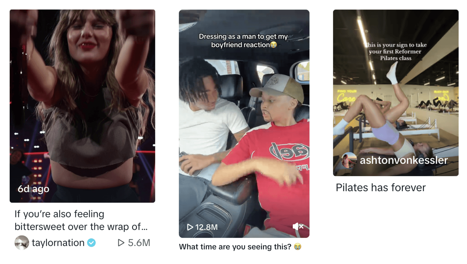
The lack of a proper grid system and consideration for responsiveness meant that elements were abruptly cut off at various breakpoints. Common screen sizes weren’t accounted for, and video grid pages had inconsistent layouts, with different styles for preview cards across the site.
Design Principles
After synthesizing user research and identifying the biggest opportunities, we defined a set of design principles to guide the redesign. We started with the highest-impact surfaces, prioritized the components that needed to be created or evolved, and partnered closely with cross-functional teams to ensure the system could scale across the web experience. Throughout the process, we continually asked:
How might we design a web experience that embraces desktop-specific behaviors while staying true to TikTok’s core product experience?
Immersive
The redesign prioritizes an immersive experience by minimizing distractions. Use subtle visual cues to enhance user engagement and encourage deeper immersion in the videos.
Content-first
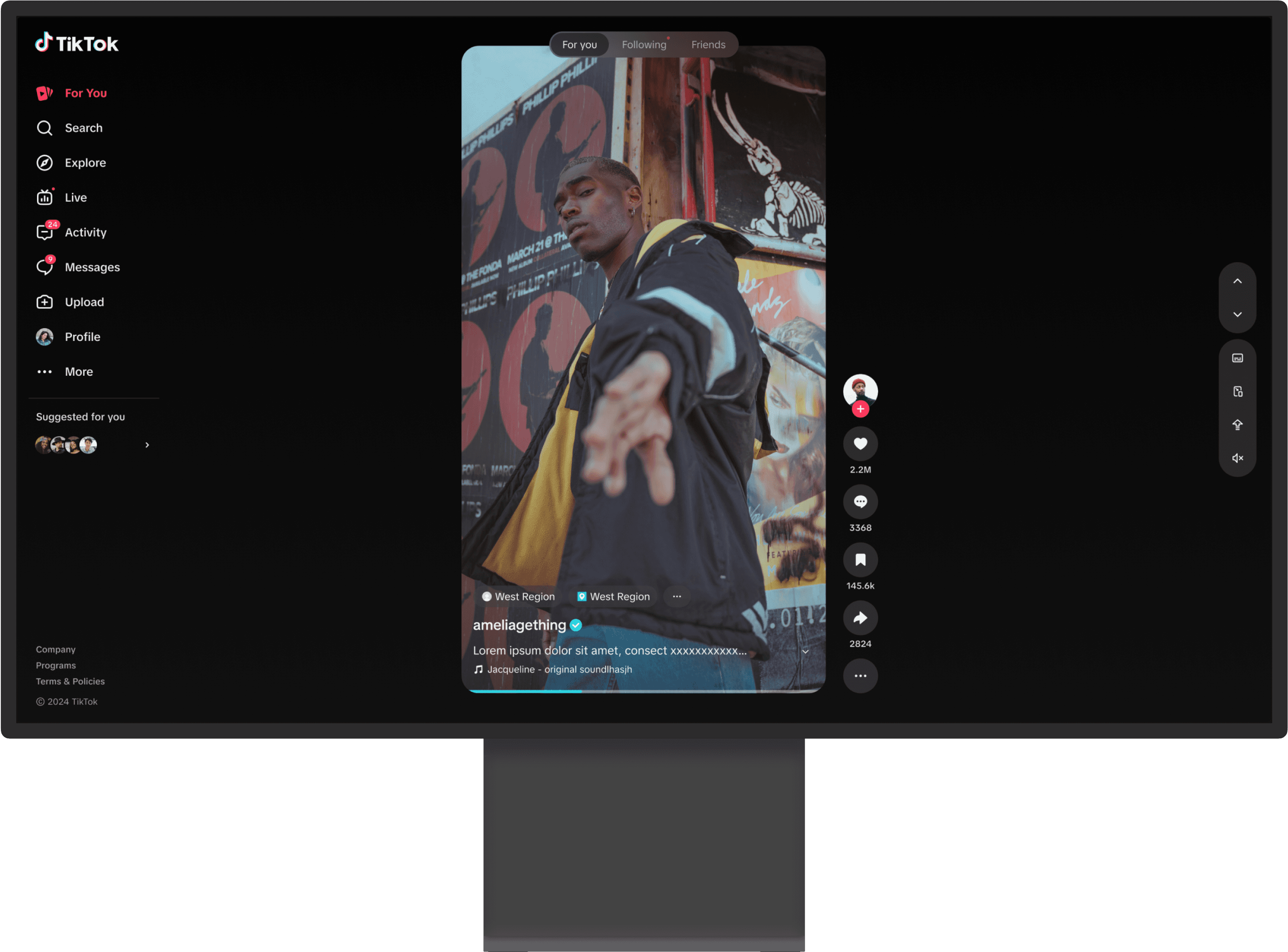
The redesign puts video content front and center. This "content-first" approach emphasizes TikTok's core value: providing engaging and entertaining video content.
Seamless
The redesign ensures seamless transitions and content discovery, allowing users to effortlessly browse, watch, and interact with videos. Smooth animations and intuitive navigation keep users engaged within the flow of their experience, reducing friction.
Efficient
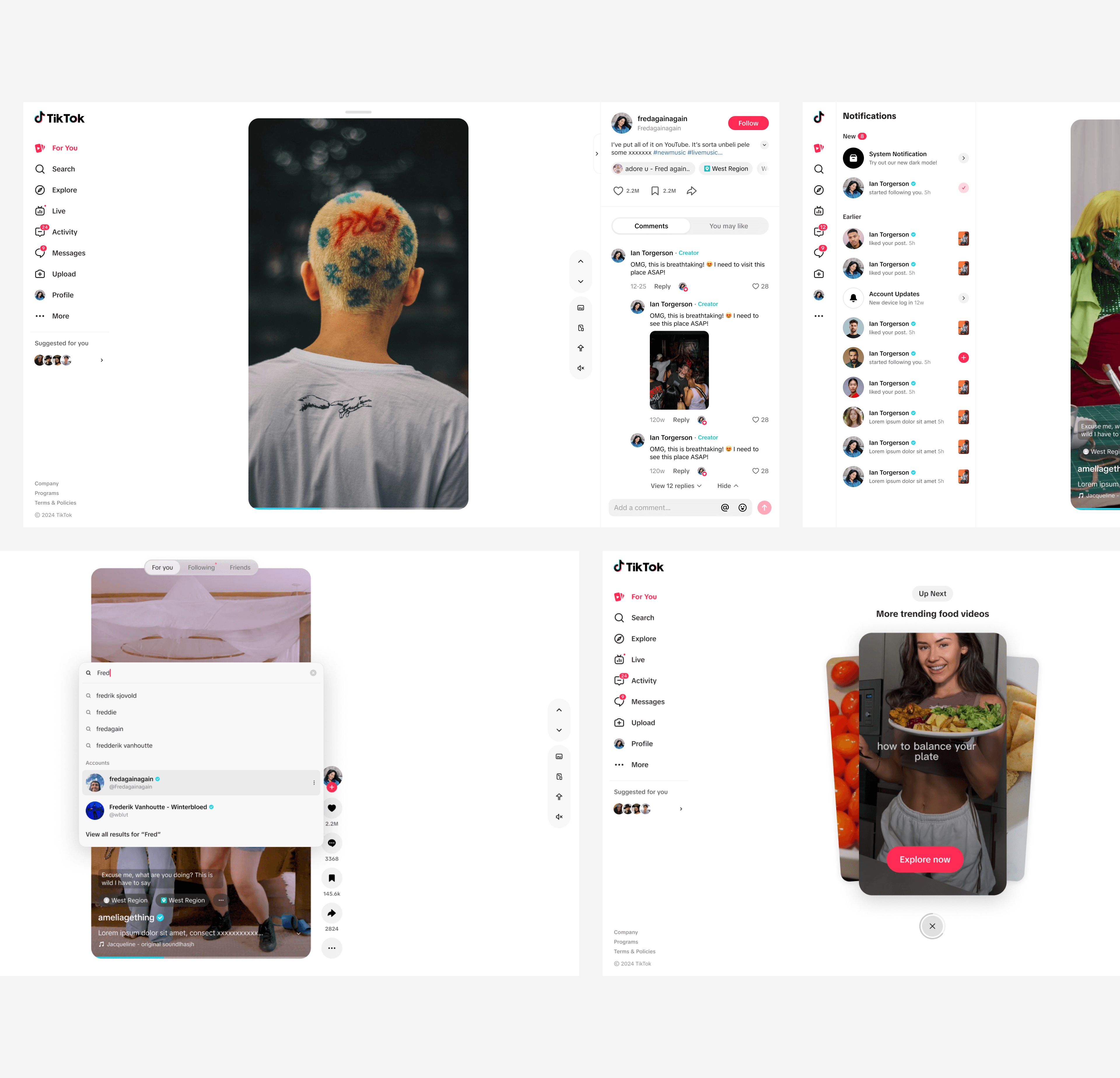
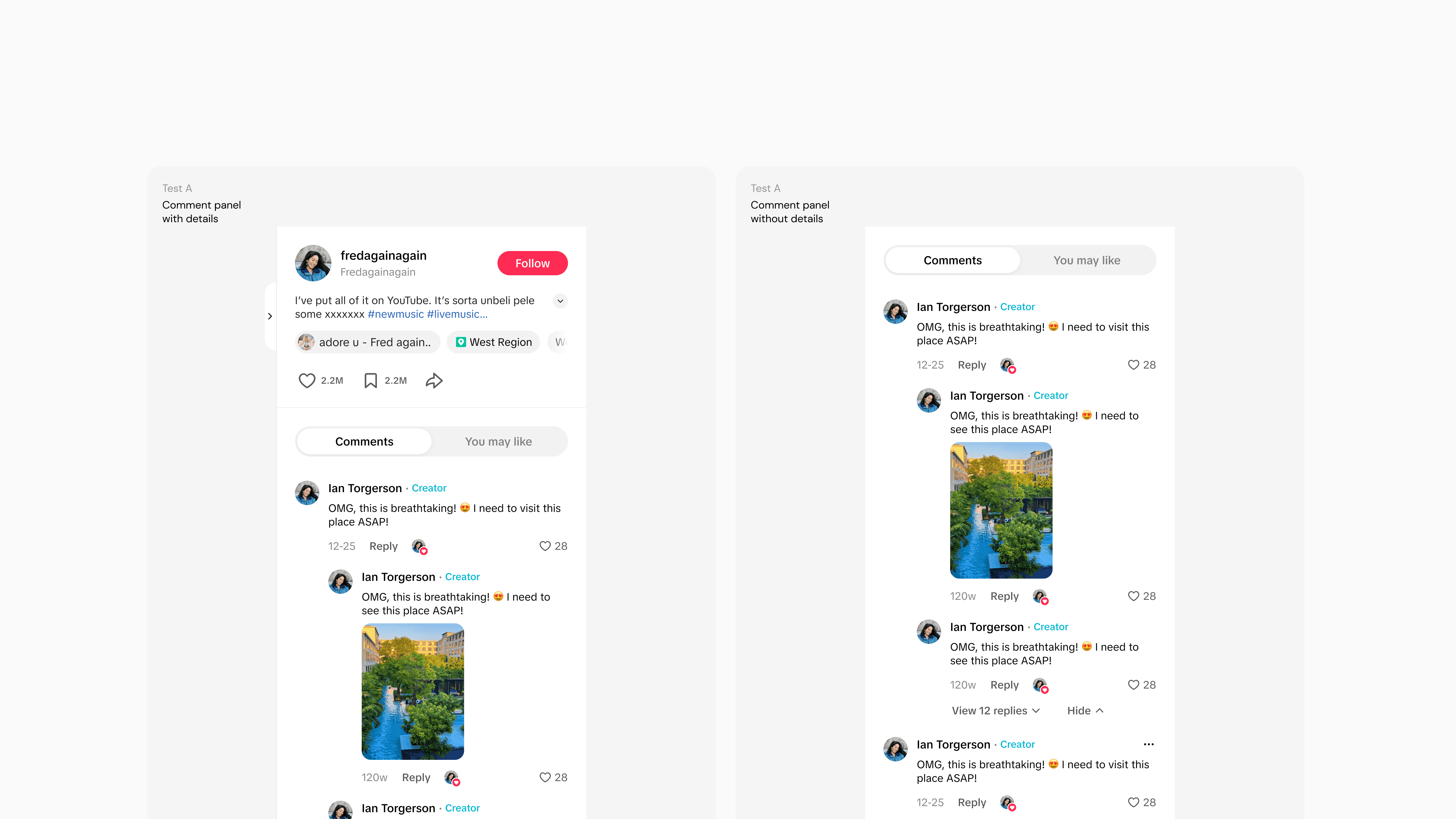
The redesign prioritizes efficiency by streamlining interactions and providing quick access to essential features. The integrated video details panel, playful interaction slideshow, and global search with keyboard shortcuts all contribute to a more efficient and intuitive user experience.
A/B Test
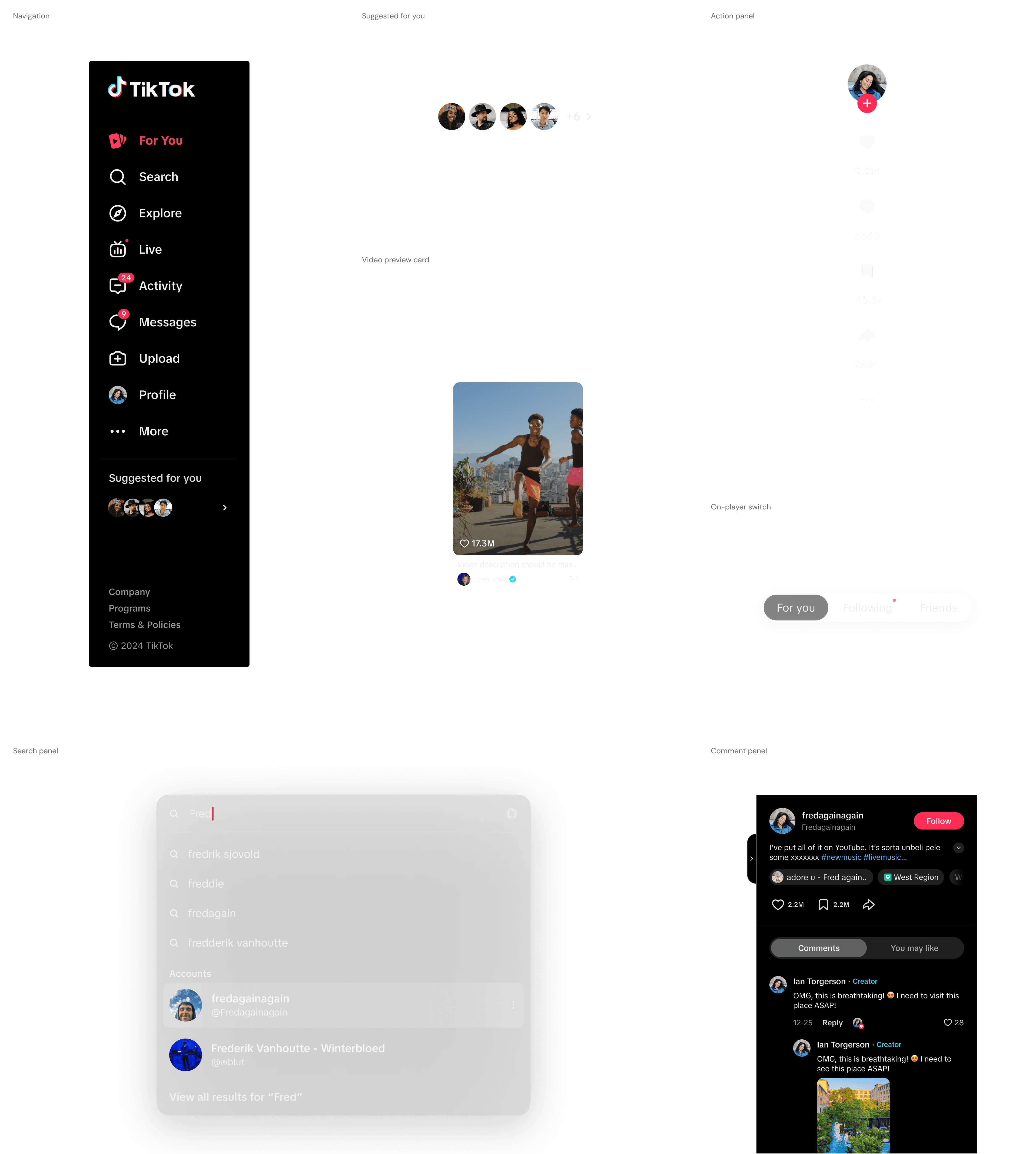
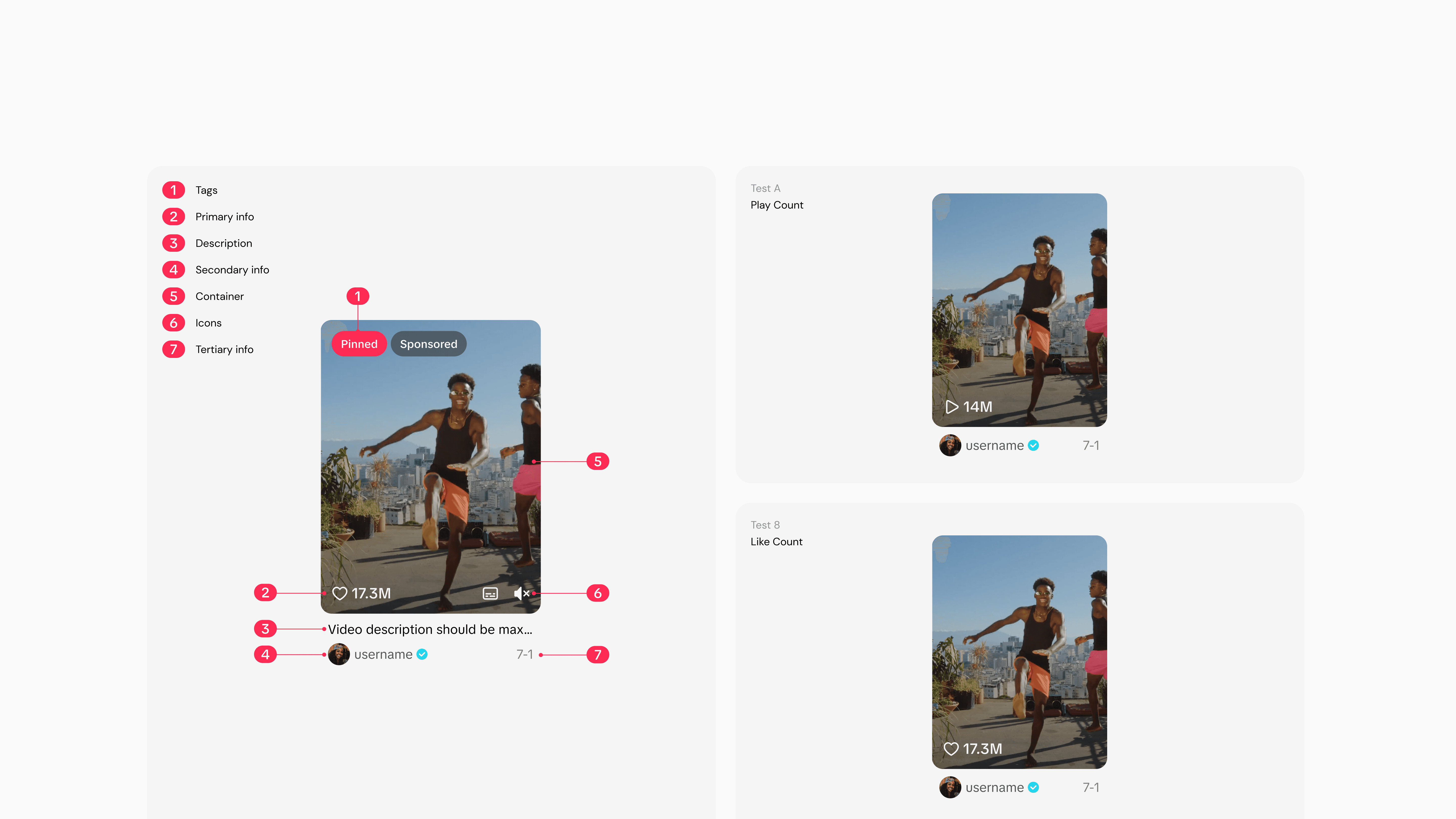
We collaborated closely with the TikTok Design System team to define which components should be created new or expanded using existing components. The Web redesign team was responsible for creating new web-specific components and the Design System team focused on making the existing components flexible to use in web.
We developed 2-3 variants to test their impact, ensuring we didn’t negatively affect key performance metrics. We also structured the components to be easily modifiable for quick updates and seamless A/B testing.
Outcome
After completing the component work, we collaborated closely with the Product and Engineering teams to redesign all key pages. We developed a phased roadmap that introduced the new design incrementally. This approach allowed for smoother integration while addressing the most critical user needs first.
xxx resulting in increases in key metrics